EMBELLISHED MAT BOARDS - by Framing Fabulous

EMBELLISHED MAT BOARDS - by Framing Fabulous

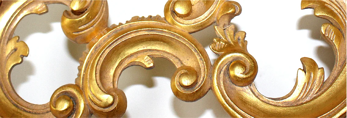
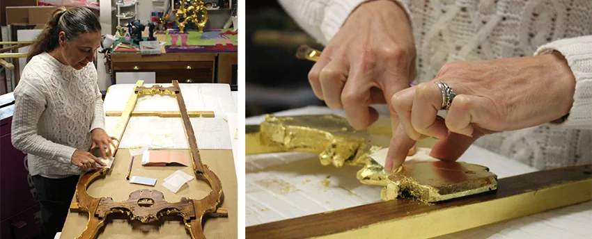
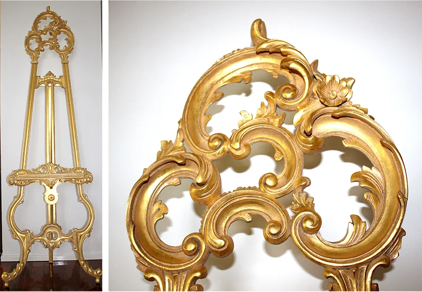
A unique service that we offer at Framing Fabulous is one of a kind, hand crafted mat boards.  Individually designed, hand embossed and gilded mat-boards add ‘wow factor’, and can be works of art in themselves. While not necessarily suited to every piece, in the right combination the results can be spectacular.

Elaborate or simple, the mat-boards are styled and designed in consultation with you to complement each piece. The designs can be partial, or entirely cover the mat board. Often the design will echo elements from the print or image. No two designs are ever quite the same and the possibilities are endless.

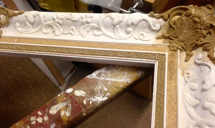
The above mat board and frame were both designed specifically for this art deco print. The hand embossed mat design echoes the art-deco style of the painting within. It has been gilded in 23kt gold with a distressed finish. The result is an eye grabbing, romantic, glowing piece in which the frame, mat and print all compliment and enhance each other. 

The mat board above was created as a wedding gift. The bride and grooms name and date of wedding have been included in the design, for them to later add their favourite wedding photo. This mat is hand embossed and gilded in 23kt gold with distressed finish.

The images above (left and center) is an example of a partially embossed mat boards. The example above (right) is partially gilded with floating embossed cutout elements.

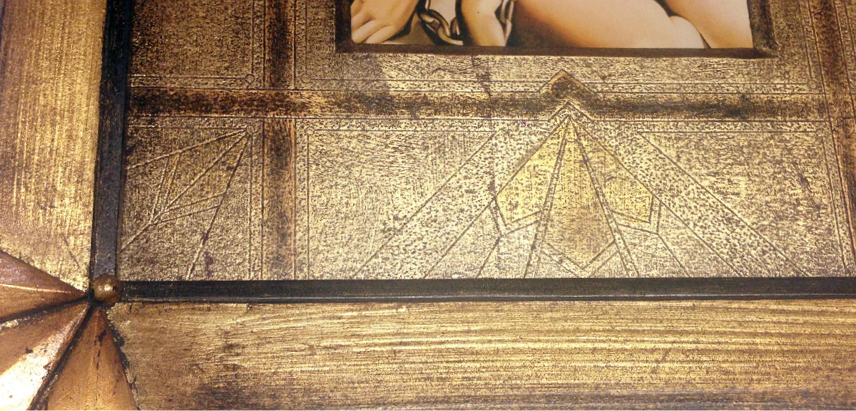
This piece is a thin, inner mat, that enhances the overall impact of the work without overwhelming the print within.  It has been embossed and gilded in 23kt gold (with colour highlights).

The above example is a fully embossed and gilded silver mat.


HOT TIP!… these make brilliant gifts for weddings, landmark birthdays, anniversaries, births (etc). We can bring all the creativity, or if you have a particular idea or style in mind, we can do that too. Get in touch to see what we can create for you.

Gilding a Showstopper!

Gilding a Showstopper!

I recently had the pleasure of working on an unusual gilding job - a beautifully carved ornate easel.  Although the easel was stunning to begin with (as shown below), the owners wanted to make a show piece of it by gilding it in 23Kt gold.

Gilding such a large intricate piece was challenging with the 3 - dimensionality, and sheer size of the easel.

Once in the studio, I disassembled the easel, reducing it to much more manageable sized pieces, making it a lot easier to tackle. The next step was to strip back the old shellac and many years of wax build up, so that I had a clean surface to gild. This involved washing it down with 2 different solvents, 3 pairs of rubber gloves, and a lot of elbow grease!

Each section had to be oiled, gilded and cleaned before I applied the shellac to each side, then the process was repeated on the reverse side. Some of the more intricate sections were double gilded, as the rough texture of the timber prevented proper adherence of the gold leaf.

Once I had completed gilding all sections, similar steps were taken to tone the whole piece... toning, cleaning, then repeating on the opposite side.

It was a great feeling when I got to put the whole thing back together again and stand back to see the finished effect.

Tadaaah..!

EARLY INSPIRATIONS... My brush with John Olsen

I started my life as a framer when I was just 16 and still in high school in Bathurst, NSW. I worked part time at first, in the local art supplies and framing shop Pigments and Palettes, that was in those days owned and run by artist Bob Romano.

Bob was a gentle, caring, eccentric man, originally from Italy where he studied art. He loved everything art and shared that with everyone who walked in the door of Pigments and Palettes. We would work to classical music and talk about art and technique all day. He taught me how to choose sympathetic colours when choosing a frame and how to hand colour moulding to suit a particular artwork. It was Bob, who sparked my framing fire!

Illustration of Irene by Bob Romano, 1988 (left) ; Bob Romano, Irene Zapel and coworkers, Pigments and Palettes 1987 (right).

Illustration of Irene by Bob Romano, 1988 (left) ; Bob Romano, Irene Zapel and coworkers, Pigments and Palettes 1987 (right).

A number of prominent artists lived in the Bathurst area, and as some were old friends of Bob's they would pop in for a few art supplies and a cup of tea. Being a young and impressionable budding artist, I was quietly excited when they visited. It was the highlight of my day to make tea or coffee for such inspirational artists as John Olsen, Brett Whitely, Ken Ungley, Graham Lupp, Reg Campbell and David Wilson - all of whom have left something of their passion with me still.

I was in the shop one morning when two men came in to purchase some water colours. Upon enquiring who to make out the receipt to, I was told “J Olsen”. My brain started ticking over having just failed an assessment at school on a John Olsen painting. “That wouldn’t happen to be John Olsen would it?” When he replied yes, I asked if he was the same John Olsen responsible for the painting Entrance to the Seaport of Desire (the painting I had just flunked on). “Oh, you know my work” he replied. If only he had come in 2 weeks earlier before I failed my assessment. John Olsen indulged me in a long chat about what I had written, and it seemed I shouldn't have failed after all.

John would pop in from time to time after that and always have a cup of tea or coffee and talk with me about art. He even bought, for the grand sum of $10, a daggy little painting I had done of Ayres rock. It is simple encouragement from inspirational people like him that have kept me painting and involved with art all my life.

Working for Graham Reynolds some 20 or more years later, I had the opportunity to make the frames for several John Olsen originals. This well known Australian artist has been pivotal in how I think about art, and now I have framed his originals... something I am very proud of and grateful for.

'Entrance to the Seaport of Desire' - John Olsen (left) ; Artist John Olsen (right).

'Entrance to the Seaport of Desire' - John Olsen (left) ; Artist John Olsen (right).

PASTIGLIA - love of the process

PASTIGLIA - love of the process

One framing technique that I love to use is Pastiglia, or 'pastework'. This is a technique used to apply a bass relief pattern to a frame (furniture or artwork) using gesso. It was developed in renaissance Italy and used extensively between the 14th and 16th centuries as a cost effective method of imparting patterning. Pastiglia is the renaissance equivalent of composition moulding (developed in the late 18th century).

The process itself is very time consuming, requiring layer upon layer of gesso be applied to build up to the desired depth. Talking with a friend about this technique, she expressed that I must find it very tedious. But on the contrary, I find the process quite meditative and the slow emerging of detail really rewarding... I will often lose track of time. The process is enjoyable to me and the investment of time pays off with such a gorgeous finished product!

Gesso has a tendency to crack if applied in one thick layer, so each layer needs to dry before the next one is applied, especially when doing higher relief patterning such as the frame below. You can see the layers in this first image...

FramingFabulous-pastiglia early stage

By this stage (below), I have begun carving and sanding the pastiglia to refine the pattern...

Framing Fabulous-Pastiglia early stage - 2

In the below images, the pastiglia work is complete, and finer patterning in composition moulding and a sand panel has been added...

Framing Fabulous - Pastiglia - sand panel

My role in the creation of this frame was to apply to pastiglia and composition, and it was then sent on to the Western Australian Art Gallery for finishing / completion.

A Complex Restoration

To successfully and seamlessly restore a frame, you need to have an understanding of how the frame was constructed, the materials used such as the timber and composition materials, and what type of gilding and finishing techniques were applied. Unfortunately many frames have been 'restored' without this basic knowledge, and as a result the repairs are short-lived, conspicuous and often do more damage than good.

This was one of those frames; a beautiful 19th century water gilded oval frame with top and bottom ornate composition crests. The oval was largely intact and undamaged, but it was clear that the crests had suffered breakage and had been clumsily glued back together (with shiny globs of glue still visible). The 'restored' section of frame had been painted and was clearly not the original finish.

As I am of the firm belief that as much of the original finish be maintained as possible, the main oval was masked off so that I could work on the crests on their own. Both crests were stripped back of all previous finishes including the original gilding, and the large cracks and missing sections were filled and re-carved.

Gesso was then applied to the frame (3 layers in this case), and then carefully sanded ready for bole. First a yellow bole or gilders clay is applied, and then a red on the tips of the decoration. The bole can be seen underneath the gild and enhances the colour. The gild is often rubbed away or distressed to expose the bole underneath.

After the bole had dried, the frame was polished to remove any raised grains or irregularities in the finish, providing as smooth a surface to gild as possible. The tips of the frame were then water gilded, burnished and sealed with shellac in preparation to oil gild the receding areas of ornamentation.

After completing the gild, the frame was treated with a stained shellac to match the yellowing of the aged original gild, and toned to match in with the original finish.

I love working on jobs like this… The processes involved and the transformation at the end of those processes is extremely satisfying. It is rewarding knowing that you have brought the beauty, history and integrity of the original crafter back.

The completed frame now looks much as it would have when first crafted.